Checking out a new city for a job? Or need some quick stats for a story where you are working? The Data Dashboard, part of the Urban Institute‘s Metro Trends is a helpful resource.
You will find 366 metro areas profiles with charts and stats on:
- unemployment
- housing prices
- net migration
- jobs gain or loss
- crime
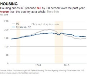
Here’s one of the tables from my home city, Syracuse, showing housing prices, compared to US averages. I’m pleased to see we’re above average!
This would also be a useful resource to compare how your metro area is doing compared to the next one down the road.
What other gems have you found lately that you’d like to share? Drop me a note below.
